I have written about this in responses on other threads here at GateFans, but I think it deserves its on thread on this Trek forum. The design of the new USS Enterprise is unacceptable, simply put. A comprehensive article about this from disapproving fans is here:
http://www.ex-astris-scientia.org/articles/new_enterprise_comment.htm
EXCERPT:
As you can see, Trek fans like the one who wrote that comment are serious about their Trek. Engineers who are fans are going to scowl at the notion of fashion over function in this new ship. Many of the elements of the new ship are gimmicky and useless in terms of function. That anyone would design the ship in this fashion is appalling in a geeky way. I dont like it for the most part. Graphically, here are the main things I dont like:


Essentially the same elements that this fan takes issue with. Here is another one:
http://www.trekbbs.com/showthread.php?p=2306844

Paramount will MAKE Abrams change it, mark my words. Maybe not this next film but certainly by the third.") The shuttles arent all that great either, but the proportions and size is within Trek Spec. The shuttlebay on Enterprise is not, however. Even the doors that open on it suck. ILLOGICAL. I think the bridge will also have to change quite a bit, but first change the ship, since Trek has always had as its biggest character the ship itself. I cannot find love in my heart for this ship in its current form.
The shuttles arent all that great either, but the proportions and size is within Trek Spec. The shuttlebay on Enterprise is not, however. Even the doors that open on it suck. ILLOGICAL. I think the bridge will also have to change quite a bit, but first change the ship, since Trek has always had as its biggest character the ship itself. I cannot find love in my heart for this ship in its current form.
Paramount, please change it!
http://www.ex-astris-scientia.org/articles/new_enterprise_comment.htm
EXCERPT:
Aesthetics
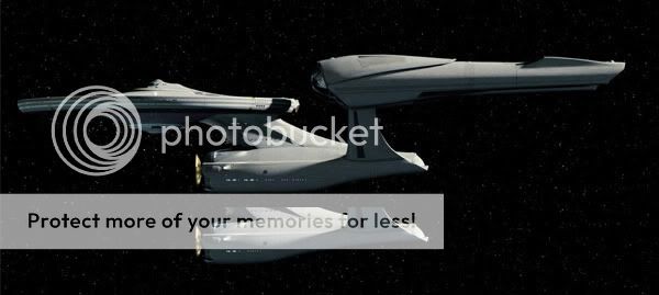
The new design by Ryan Church is unsatisfactory. First off, irrespective of all continuity concerns, I simply don't think it is a great design. I concede that it is overall not quite the butt-ugly "Edselprise" that I saw in it at a first glance and that made me cry in terror. Still, the classic shapes of the saucer and the deflector don't mix with the stylish add-ons and the intricate curvatures. This way it appears like a kitbash, like an odd blend of the TMP Enterprise with an alien CGI ship of the week. The overall proportions are not sufficiently balanced, and the whole ship seems to lean forward too much. I imagine that the engineering hull including the nacelle struts should be moved back relative to the saucer, neck and nacelles to get its look "right". The engineering hull initially appeared to be too small relative to the saucer, but in hindsight I have to admit that the perspective of the photo was deceptive. Yet, the massive neck looks odd relative to the rather small engineering hull.
Overall, the design does not have the clarity that can be found on Jefferies' original Enterprise, on Probert's TMP Enterprise and Enterprise-D or, to somewhat lesser extent, on Eaves' Enterprise-E. It simply takes features that were deemed inevitable, such as the saucer and the protruding deflector dish (albeit the latter was heavily modified), and supplements them with stylish curvatures and decent hull greeblies as they are commonplace in modern sci-fi films. The Enterprises of the past were design classics in much the same fashion as a '57 Corvette or even an iPod. The new one reminds me of the design experiments of car manufacturers such as BMW or Renault, who added aggressively shaped headlights or "illogical" curved edges to otherwise conventional looking cars.
Technology
On the technical side, there was a discussion whether the Bussard collector might be blocked by the saucer, which is not the case though. The curved backlit cowling (the light obviously being warp plasma), on the other hand, that I already dislike for its mere look does not make much sense, as in this region of the nacelle we would expect the warp coils. And since these are always straight for all we know, having a warped plasma outlet is a useless fad.
Furthermore, while all other parts of the ship are more solid than on either the TOS and the TMP Enterprise, the nacelle struts are relatively thin compared to ships of other classes - especially considering that the new Enterprise is being built on the ground. But even worse, the pylons run into the engineering hull in the region of the shuttlebay. The pylon structure and the power transfer conduit have to continue somehow inside the ship. Although the cross-section of the new shuttlebay is relatively about the same as on the original and on the refitted Constitution (at Church's original design size of 366m), it may be further obstructed by the warp pylons. In the movie itself we get a glimpse of the open shuttlebay, where two rows of the large new shuttles are stacked on either side of the shuttlebay. A ship of 366m length would not be big enough for that. Anyway, on screen there is no sign of the power transfer conduits inside the shuttlebay, so it may work out after all, unless the CGI ship "cheats" in a way that the pylons simply do not continue inside the ship.
As you can see, Trek fans like the one who wrote that comment are serious about their Trek. Engineers who are fans are going to scowl at the notion of fashion over function in this new ship. Many of the elements of the new ship are gimmicky and useless in terms of function. That anyone would design the ship in this fashion is appalling in a geeky way. I dont like it for the most part. Graphically, here are the main things I dont like:
Essentially the same elements that this fan takes issue with. Here is another one:
http://www.trekbbs.com/showthread.php?p=2306844
I FRIGGIN' HATE IT! ... was my kneejerk reaction. I simply couldn't believe that J.J. A. would screw with us this way... nothing made any logical progression sense. This is NOT what a pre-TOS Enterprise would look like. It's like re-filming the Titanic disaster but using the QE-2 instead. Once again, we have another Hollywood swell-head putting his illogical my-way-is-oh-soooo-cool twist on redoing cinematic history.
But I kept looking at everything,... the sets, the ship exterior, the new trailer. Why would he have a bridge that was obviously visually advanced from what it was to precede? What was up with the bizarre stylistic collision of the ship's exterior? WHAT THE HELL IS GOING ON???
Paramount will MAKE Abrams change it, mark my words. Maybe not this next film but certainly by the third.
The shuttles arent all that great either, but the proportions and size is within Trek Spec. The shuttlebay on Enterprise is not, however. Even the doors that open on it suck. ILLOGICAL. I think the bridge will also have to change quite a bit, but first change the ship, since Trek has always had as its biggest character the ship itself. I cannot find love in my heart for this ship in its current form.Paramount, please change it!
 i gots the hookup